You’re in Lancaster, and you need banners that don’t just hang there but command attention. You’ve likely faced the frustration of designs that fade into the background, lost in the visual noise of farmers’ markets, bustling streets, or local events. Perhaps you’ve even experienced the sinking feeling when a crucial event is looming, and your printing partner misses a promised deadline, leaving you with a gaping hole where your marketing message should be.
We certainly have. Just last quarter, a local artisan craft fair client rushed in, their faces etched with worry. Their main banner, critical for their stall’s visibility, was supposed to be ready from their previous printer days before. It wasn’t. The deadline had passed, and panic was setting in. They needed a solution, fast. We saw their predicament, understood the urgency, and, without hesitation, we prioritized their order. As soon as the artwork hit our digital doorstep, we were on it, running the job through our presses with the speed and precision of an emergency response team. We delivered their vibrant, perfectly printed banner just in time, ensuring their stall stood out and their sales weren’t compromised. That’s the kind of reliability and dedication we bring to every project. Now, let’s delve into how you can ensure your banners in Lancaster are not just seen but remembered.
Before you even begin to sketch an idea, grounding your banner design in its intended environment is paramount. Lancaster’s unique character, from its historic downtown to its vibrant agricultural peripheries, presents distinct opportunities and challenges for banner visibility. A banner intended for a busy intersection downtown will require a different approach than one gracing the entrance to a rural festival. Consider the typical viewing angles, the speed at which people will be moving past it, and the overall atmosphere of the location. This foundational step ensures your banner isn’t just a decorative element but a strategic tool.
The Lancaster Landscape: A Canvas for Your Message
The visual tapestry of Lancaster is rich and varied. Your banner will interact with a multitude of backdrops: the aged brickwork of historic buildings, the green expanses of parks and farmland, the dynamic flow of traffic, and the concentrated energy of community gatherings. Recognizing this diverse environment will inform your design choices.
Downtown Districts and Pedestrian Flow
In areas like Central Market or the surrounding streets, pedestrian traffic is often dense. This means your banner needs to be legible at closer distances and engaging enough to catch the eye of someone strolling by. Think about the details that can be appreciated up close, but ensure the core message is immediately apparent.
Rural Roadways and Event Venues
For banners promoting events on the outskirts or along county roads, the viewing distance is typically greater, and traffic may be moving at higher speeds. In these instances, bold, simple designs with high contrast are essential. Clarity of message over intricate detail becomes the priority.
Community Events and Local Festivals
Lancaster hosts numerous festivals and fairs throughout the year, from the agricultural societies to the arts and crafts shows. These are often vibrant, sometimes chaotic environments. Your banner needs to cut through the visual clutter and clearly communicate your presence and offering.
Defining Your Banner’s Mission
Every banner serves a purpose. Is it to announce a sale, promote an event, establish brand recognition, or direct traffic? Clearly defining this mission will shape every subsequent design decision. A banner for a grand opening will have a different tone and call to action than one advertising a community food drive.
Brand Reinforcement as a Long-Term Investment
For businesses, banners can be a cost-effective way to reinforce brand identity. Consistent use of logos, color palettes, and typography across various banners builds recognition and trust over time. Think of your banner as a consistent handshake with your audience.
Event Promotion: The Urgency of Now
Event banners require a sense of immediate relevance. They need to convey key information of who, what, when, where, why, and how quickly and persuasively. The design should evoke excitement and a desire to participate.
Call to Action: Guiding Your Audience
A successful banner doesn’t just inform; it prompts action. Whether it’s a website address, a phone number, or simply an invitation to visit, the call to action must be clear, prominent, and easy to understand.
When considering effective strategies for designing eye-catching banners in Lancaster, it’s beneficial to explore related resources that can enhance your understanding of visual marketing. One such article discusses the importance of choosing the right materials and design elements for banners, which can significantly impact their visibility and effectiveness. For more insights on this topic, you can read about banner design in nearby Rosamond by visiting this link: Banner Design in Rosamond. This resource provides valuable tips that can complement your efforts in creating stunning banners that capture attention.
Principles of Visual Hierarchy for Banner Design in Lancaster
Once you understand where and why your banner will be displayed, the next critical step is establishing a clear visual hierarchy. This is the art of guiding the viewer’s eye through your design in a logical and impactful sequence. Without it, your banner risks becoming a jumbled mess of information, akin to an orchestra playing without a conductor.
The Importance of a Focal Point
Every effective banner needs a primary element that immediately captures attention. This is your focal point, the anchor around which all other design elements orbit. It could be a compelling image, a bold headline, or a striking graphic.
Identifying Your Message’s Core
What is the single most important piece of information you want your audience to retain? This should often be your focal point. In Lancaster, where local pride is strong, highlighting a community connection or a unique local offering can serve as a powerful draw.
The Power of Negative Space
Often overlooked, negative space (or white space) is not empty; it’s a vital design element. It provides breathing room, allowing your key elements to stand out and preventing the design from feeling cramped or overwhelming. It’s the quiet in the sound that makes the music audible.
Guiding the Eye: From Headline to Detail
Once the focal point has done its job, your design should seamlessly guide the viewer’s eye to secondary and tertiary information. This is where your call to action and supporting details come into play.
Headline Impact: The First Impression
Your headline is often the first verbal interaction your banner has with your audience. It needs to be concise, engaging, and informative. In Lancaster, consider language that resonates with the local community, perhaps incorporating familiar landmarks or cultural references.
Supporting Information as Elaboration
Below the headline, provide supporting details that flesh out your message. This might include dates, times, locations, or brief descriptions of what you offer. Ensure this information is legible from your intended viewing distances.
The Call to Action: The Final Destination
The call to action is the directive. It tells the viewer what you want them to do next. It should be presented clearly and be easily actionable. For a local business in Lancaster, this could be “Visit our shop downtown” or a QR code linking directly to your website.
Color Psychology and Contrast for Lancaster Streetscapes
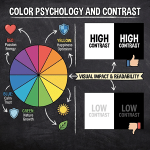
Color is a powerful, subconscious communicator. In the varied light and surroundings of Lancaster, strategic color choices can make your banner either blend in or shout for attention. Understanding color psychology and employing effective contrast is vital for ensuring your message cuts through.
Leveraging Lancaster’s Natural Palette
Consider the predominant colors in the Lancaster landscape during the seasons your banner will be displayed. While you want to stand out, completely jarring colors might feel out of place. Harmonizing with, yet contrasting against, the environment can be highly effective.
Warm Tones: Inviting and Energetic
Reds, oranges, and yellows are energetic and attention-grabbing. They can be excellent for promotional banners designed to create excitement and encourage immediate action, such as for a seasonal sale or a community festival.
Cool Tones: Trustworthy and Calming
Blues and greens often convey a sense of trust, stability, and nature. These can be well-suited for businesses aiming to project reliability or for banners promoting environmental initiatives or wellness services.
Earth Tones: Grounded and Authentic
Browns, beiges, and muted greens can evoke a sense of naturalness, authenticity, and tradition. These might complement banners for artisanal products, farming businesses, or events with a historical theme.
The Crucial Role of Contrast
Contrast is the engine of readability. Without sufficient contrast, even the most compelling message will be lost. This applies to text against background, and even between different elements within your design.
High Contrast for Maximum Impact
For banners viewed from a distance or at speed, high contrast between your text and background is non-negotiable. Think bold, dark text on a light, solid background, or vice versa. This creates immediate legibility.
Color Combinations to Avoid
Certain color combinations, like red on green or blue on purple, are notorious for creating visual strain and can make text difficult to read. Always test your color pairings to ensure they are accessible and effective.
Contrast and Brand Identity
While contrast is about readability, it also needs to align with your brand identity. If your brand uses a specific color palette, find ways to implement high contrast within those constraints, perhaps by using a lighter shade of your brand color for the background and a darker shade for the text, or vice versa.
Typography: The Voice of Your Banner’s Message in Lancaster
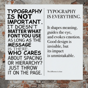
Typography is more than just choosing a font; it’s about selecting the voice that will communicate your message. In Lancaster, where a blend of historical charm and modern progress exists, your font choices should reflect your brand and resonate with your target audience. The right typeface can feel like a friendly wave, while the wrong one can be as jarring as a dropped anvil.
Legibility at a Distance: The Primary Imperative
The most beautiful font in the world is useless if it cannot be read from the intended viewing distance. For banners in Lancaster, especially those along roads or at events, legibility is paramount.
Serif vs. Sans-Serif Fonts for Banners
- Sans-serif fonts (e.g., Arial, Helvetica, Open Sans) are generally considered more legible at a distance due to their clean lines and lack of decorative strokes. They convey a modern, straightforward feel.
- Serif fonts (e.g., Times New Roman, Georgia) can add a touch of tradition, elegance, or authority. However, their small decorative strokes can become blurred at extreme distances, making them less ideal for many banner applications. For Lancaster’s historic appeal, a well-chosen serif might work for specific contexts, but sans-serifs often win for pure readability on banners.
Font Size and Weight: Making Every Letter Count
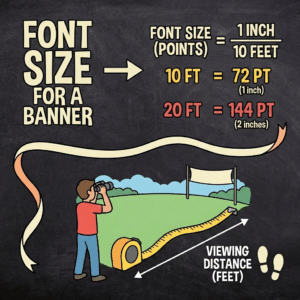
The size of your font should be scaled appropriately for the banner’s intended viewing distance. Similarly, the font weight (light, regular, bold) plays a crucial role. Bolder weights are generally more impactful for headlines and key information on banners.
Choosing Fonts that Speak Your Brand’s Language
Your font selection should align with your brand’s personality and the message you’re conveying. Generic, overused fonts can make your banner feel uninspired and indistinguishable.
Traditional and Elegant Fonts
For businesses wishing to convey a sense of history, craftsmanship, or premium quality, fonts with a classic aesthetic can be effective. Consider how these would pair with Lancaster’s historic architecture.
Modern and Bold Fonts
For a more contemporary or energetic brand, clean, geometric, or even subtly edgy sans-serif fonts can be a strong choice. These can convey innovation and dynamism.
Script and Decorative Fonts: Use with Caution
While script and decorative fonts can add personality, they are almost always best avoided as primary text on banners due to significant legibility issues, especially from a distance. They might be usable for very small, secondary elements, but even then, extreme caution is advised.
Font Pairings: Creating Harmony and Emphasis
When using multiple fonts on a banner, ensure they complement each other. A common strategy is to pair a more decorative font for the headline with a clean, legible sans-serif for body text, or vice versa, ensuring clear distinction.
The Rule of Two: Keeping it Simple
For banners, it’s generally advisable to stick to no more than two font families. This prevents visual clutter and ensures a cohesive design. One for headlines and one for supporting text is a safe and effective approach.
Hierarchy Through Typography
Use different font weights, sizes, and styles (italic, regular) to create a clear typographic hierarchy. This helps guide the viewer through the information, ensuring the most important elements are noticed first.
When considering effective strategies for creating eye-catching banners in Lancaster, it’s also beneficial to explore related insights on design principles that can enhance visibility and engagement. For instance, an informative article on banner design in Little Rock provides valuable tips that can be applied universally. You can read more about these strategies in this related article, which emphasizes the importance of color contrast and typography in capturing attention. By integrating these techniques, you can ensure your banners stand out in any setting.
Imagery and Graphics: Adding Depth and Emotion to Your Lancaster Banners
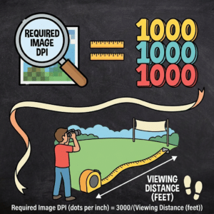
Throughout the years, many people have asked me the same question: “What should the resolution of my images be in a banner?” The answer, of course, depends on the usual distance the banner will be viewed from. Follow the information in the image below.
<!–?xml encoding="UTF-8"></p> <table border="1" cellpadding="5" cellspacing="0" style="width:100%;border-collapse:collapse;border:2px solid #f2f2f2"> <thead> <tr style="display:table-row;vertical-align:inherit;border-color:inherit;line-height:40px"> <th style="padding:12px;text-align:left;border-bottom:1px solid #e5e7eb;line-height:40px">Tip</th> <th style="padding:12px;text-align:left;border-bottom:1px solid #e5e7eb;line-height:40px">Description</th> <th style="padding:12px;text-align:left;border-bottom:1px solid #e5e7eb;line-height:40px">Effectiveness Metric</th> <th style="padding:12px;text-align:left;border-bottom:1px solid #e5e7eb;line-height:40px">Recommended Usage</th> </tr> </thead> <tbody> <tr style="display:table-row;vertical-align:inherit;border-color:inherit;line-height:40px"> <td style="padding:12px;text-align:left;border-bottom:1px solid #e5e7eb;line-height:40px">Use Bold Colors</td> <td style="padding:12px;text-align:left;border-bottom:1px solid #e5e7eb;line-height:40px">Incorporate vibrant and contrasting colors to grab attention quickly.</td> <td style="padding:12px;text-align:left;border-bottom:1px solid #e5e7eb;line-height:40px">Increases visibility by 40%</td> <td style="padding:12px;text-align:left;border-bottom:1px solid #e5e7eb;line-height:40px">Backgrounds and call-to-action buttons</td> </tr> <tr style="display:table-row;vertical-align:inherit;border-color:inherit;line-height:40px"> <td style="padding:12px;text-align:left;border-bottom:1px solid #e5e7eb;line-height:40px">Clear and Concise Text</td> <td style="padding:12px;text-align:left;border-bottom:1px solid #e5e7eb;line-height:40px">Keep messaging short and easy to read at a glance.</td> <td style="padding:12px;text-align:left;border-bottom:1px solid #e5e7eb;line-height:40px">Improves message retention by 35%</td> <td style="padding:12px;text-align:left;border-bottom:1px solid #e5e7eb;line-height:40px">Headlines and subheadings</td> </tr> <tr style="display:table-row;vertical-align:inherit;border-color:inherit;line-height:40px"> <td style="padding:12px;text-align:left;border-bottom:1px solid #e5e7eb;line-height:40px">High-Quality Images</td> <td style="padding:12px;text-align:left;border-bottom:1px solid #e5e7eb;line-height:40px">Use sharp, relevant images that support the banner’s message.</td> <td style="padding:12px;text-align:left;border-bottom:1px solid #e5e7eb;line-height:40px">Boosts engagement by 25%</td> <td style="padding:12px;text-align:left;border-bottom:1px solid #e5e7eb;line-height:40px">Backgrounds and product showcases</td> </tr> <tr style="display:table-row;vertical-align:inherit;border-color:inherit;line-height:40px"> <td style="padding:12px;text-align:left;border-bottom:1px solid #e5e7eb;line-height:40px">Strong Call-to-Action (CTA)</td> <td style="padding:12px;text-align:left;border-bottom:1px solid #e5e7eb;line-height:40px">Include a clear and compelling CTA to encourage user interaction.</td> <td style="padding:12px;text-align:left;border-bottom:1px solid #e5e7eb;line-height:40px">Increases click-through rates by 50%</td> <td style="padding:12px;text-align:left;border-bottom:1px solid #e5e7eb;line-height:40px">Buttons and highlighted text areas</td> </tr> <tr style="display:table-row;vertical-align:inherit;border-color:inherit;line-height:40px"> <td style="padding:12px;text-align:left;border-bottom:1px solid #e5e7eb;line-height:40px">Consistent Branding</td> <td style="padding:12px;text-align:left;border-bottom:1px solid #e5e7eb;line-height:40px">Maintain brand colors, fonts, and logos for recognition.</td> <td style="padding:12px;text-align:left;border-bottom:1px solid #e5e7eb;line-height:40px">Enhances brand recall by 30%</td> <td style="padding:12px;text-align:left;border-bottom:1px solid #e5e7eb;line-height:40px">Throughout the banner design</td> </tr> <tr style="display:table-row;vertical-align:inherit;border-color:inherit;line-height:40px"> <td style="padding:12px;text-align:left;border-bottom:1px solid #e5e7eb;line-height:40px">Readable Fonts</td> <td style="padding:12px;text-align:left;border-bottom:1px solid #e5e7eb;line-height:40px">Choose fonts that are easy to read from a distance.</td> <td style="padding:12px;text-align:left;border-bottom:1px solid #e5e7eb;line-height:40px">Reduces bounce rate by 20%</td> <td style="padding:12px;text-align:left;border-bottom:1px solid #e5e7eb;line-height:40px">Headlines and body text</td> </tr> <tr style="display:table-row;vertical-align:inherit;border-color:inherit;line-height:40px"> <td style="padding:12px;text-align:left;border-bottom:1px solid #e5e7eb;line-height:40px">Proper Layout and Spacing</td> <td style="padding:12px;text-align:left;border-bottom:1px solid #e5e7eb;line-height:40px">Organize elements to avoid clutter and improve flow.</td> <td style="padding:12px;text-align:left;border-bottom:1px solid #e5e7eb;line-height:40px">Improves user comprehension by 45%</td> <td style="padding:12px;text-align:left;border-bottom:1px solid #e5e7eb;line-height:40px">Overall banner structure</td> </tr> </tbody> </table> <p>Beyond text and color, compelling imagery and graphics are vital for making your banner emotionally resonant and visually dynamic. In Lancaster, with its rich agricultural heritage and artistic community, the right visuals can create a powerful connection with locals and visitors alike.</p> <h3>Selecting Imagery that Resonates Locally</h3> <p>When choosing images, consider what will speak to the people of Lancaster. This could involve local landmarks, scenes that reflect the area's lifestyle, or imagery that directly relates to your product or service in a way that feels authentic to the region.</p> <h4>High-Quality Photography: A Window to Your Offering</h4> <p>If you're using photographs, ensure they are high-resolution, professionally taken, and relevant to your message. Blurry or irrelevant images can detract from your banner's impact. Think of a beautiful photograph as a well-crafted story told in a single frame.</p> <h4>Illustrations and Graphics: Conveying Concepts</h4> <p>Illustrations and graphic elements can be incredibly effective for conveying abstract ideas or for creating a unique brand style. They offer a consistent visual language that can be a powerful tool for recognition.</p> <h3>Graphic Elements for Visual Interest and Clarity</h3> <p>Simple graphic elements can add a layer of sophistication and help to organize information on your banner.</p> <h4>Icons for Quick Comprehension</h4> <p>Icons are universal symbols that can quickly communicate concepts, such as social media handles, contact methods, or product categories. When used judiciously, they enhance readability and reduce the amount of text needed.</p> <h4>Shapes and Backgrounds: Structuring the Design</h4> <p>Geometric shapes, subtle gradients, or textured backgrounds can provide structure and visual appeal. They can be used to frame key information or to create a distinct visual style that reinforces your brand.</p> <h4>Data Visualization: Presenting Facts (With Caution)</h4> <p>If your banner needs to convey data or statistics, consider if simple charts or infographics can be effectively rendered at banner size. Accuracy and simplicity are key in this context.</p> <h3>The Role of the Logo: A Beacon of Brand Identity</h3> <p>Your logo is often the most recognizable element of your brand. Its placement and prominence on the banner are crucial for brand recall.</p> <h4>Logo Placement Strategies</h4> <p>Consider placing your logo in a consistent location on all your banners for maximum brand association. Corner placements are common, but you might also integrate it within the overall design if it doesn’t compromise legibility.</p> <h4>Logo Size: Balancing Visibility and Subtlety</h4> <p>Ensure your logo is large enough to be easily seen but not so large that it overpowers the primary message of the banner. The goal is for it to be a recognizable anchor, not the sole focus.</p> <h2>Material Selection and Durability: Ensuring Your Lancaster Banners Stand the Test of Time</h2> <p>In Lancaster, where the weather can range from the heat of summer to the chill of winter, the materials you choose for your banners are critical to their longevity and overall effectiveness. A banner that deteriorates quickly not only looks unprofessional but also represents a wasted investment. Choosing the right material is like building a strong foundation for your message.</p> <h3>Understanding Banner Material Properties</h3> <p>Different materials offer varying levels of durability, flexibility, and suitability for different environments. It’s important to match these properties to your intended use.</p> <h4>Vinyl Banners: The Workhorse</h4> <p>Vinyl banners are the most common choice due to their durability, water resistance, and versatility. They are well-suited for both indoor and outdoor use and can withstand a reasonable amount of wind and weather.</p> <ul> <li><strong>13 oz. Vinyl:</strong> A standard weight, good for general use and short-to-medium term displays. It’s strong enough for most applications but can be susceptible to strong winds if not properly secured.</li> <li><strong>18 oz. Vinyl:</strong> This heavier weight offers increased durability and resistance to tearing, making it ideal for banners that will be exposed to more challenging weather conditions or for longer-term installations.</li> <li><strong>Mesh Vinyl:</strong> This perforated vinyl allows wind to pass through, significantly reducing the “sail effect” and making it an excellent choice for large banners in windy locations, such as along roadways or event venues with high wind exposure.</li> </ul> <h4>Fabric Banners: Elegance and Versatility</h4> <p>Fabric banners offer a more sophisticated look and feel, often used for indoor events, trade shows, or high-end retail displays. They are lighter than vinyl and can be folded for easier transport.</p> <ul> <li><strong>Polyester Fabrics:</strong> Various polyester blends offer good durability and can be printed with vibrant colors. They are often chosen for their ability to drape nicely.</li> <li><strong>Canvas:</strong> While less common for large outdoor banners, canvas can provide a classic, artistic feel for indoor displays or promotional items.</li> </ul> <h3>Considering Environmental Factors in Lancaster</h3> <p>The specific conditions your banner will face in Lancaster will dictate the best material choice.</p> <h4>Wind Resistance: A Critical Factor</h4> <p>Lancaster can experience significant wind, especially in open areas and during certain seasons. For banners exposed to the elements, choosing materials with good wind resistance, like mesh vinyl, or ensuring robust grommet placement and secure attachment methods is essential.</p> <h4>UV Resistance: Preventing Fading</h4> <p>Direct sunlight can cause banner colors to fade over time. High-quality inks with UV inhibitors are crucial to maintain the vibrancy and legibility of your banner’s design.</p> <h4>Water and Weather Resistance</h4> <p>For outdoor banners, water resistance is important to prevent damage and maintain appearance. Vinyl and specially treated fabrics offer good protection against rain and moisture.</p> <h3>Grommets, Hemming, and Reinforcements: The Unsung Heroes</h3> <p><br></h2> <p><iframe width=”740″ height=”416″ style=”display: block;margin: 0 auto;” src=”https://www.youtube.com/embed/S-dudJJYPOg” frameBorder=”0″><br ?–>
The finishing touches on your banner are as important as the design itself. Proper hemming and grommet placement ensure your banner can be securely fastened without tearing.
Grommet Spacing and Placement
Grommets are metal rings inserted into the banner’s edge to provide attachment points. Consistent spacing and reinforcement around grommets are vital for distributing tension evenly and preventing premature failure.
Reinforced Hemming
Hemming is the process of folding and stitching the edges of the banner. Reinforced hemming adds strength and durability to the banner’s perimeter, preventing the material from tearing at the edges, especially around grommets.
Pole Pockets and Rope Systems
Depending on how your banner will be displayed, pole pockets or integrated rope systems might be a more suitable or complementary fastening method to grommets. These ensure a taut display and can be more aesthetically pleasing in certain contexts.
Get FREE Quote
FAQs
What are some key elements to consider when designing eye-catching banners in Lancaster?
When designing banners in Lancaster, key elements include using bold and contrasting colors, clear and readable fonts, concise messaging, high-quality images, and incorporating local themes or landmarks to connect with the audience.
How important is the size and placement of a banner in Lancaster?
Size and placement are crucial for visibility and impact. Larger banners are more noticeable from a distance, while strategic placement in high-traffic areas in Lancaster ensures maximum exposure to the target audience.
What materials are best for outdoor banners in Lancaster’s climate?
Durable materials like vinyl or mesh are ideal for outdoor banners in Lancaster, as they withstand weather conditions such as rain, wind, and sun exposure, ensuring longevity and maintaining visual appeal.
How can I make my banner stand out among competitors in Lancaster?
To stand out, use unique and creative designs, incorporate local cultural elements, use eye-catching colors, and include a clear call-to-action. Additionally, professional printing and finishing can enhance the banner’s quality and appeal.
Are there any local regulations in Lancaster regarding banner advertising?
Yes, Lancaster may have specific regulations regarding banner size, placement, and duration of display. It is important to check with local authorities or the city’s planning department to ensure compliance with all advertising rules.
0 Comments